

Album Art Dreams with Record Designer Rachel Cabitt
Always judge a record by its cover.

You mosey past two giant stone lions and push through the heavy rotating door of your local public library.
It’s all there: the emerald green lamps and the long wooden desks — even the muted crunch of visitors quietly sneaking pocket potato chips into their hungry-bored mouths. But there’s another sound floating around…
You follow it — a melody? a harp? it sounds…musical. You’re in the stacks. The shelves look strange. You’re looking for “Hitchhiker’s Guide to the Galaxy” but the book spines are difficult to read, and far too thin…these books seem to be written by, wait, what are these: collectives?
Peter, Paul, AND Mary? Who the fuck are the Viagra Boys???
You whip around. Strangers lounge in mid-century modern chairs. Long curlicue chords connect their chunky headphones to vintage turntables. The people hold up albums, compare covers, read liner notes, take photos. Others stand at computer screens, typing in heinous search terms: “hippie lettering,” “distorted faces,” “lightning strikes.”
Hands shaking, you slide a spine from its place on the shelf. And, immediately, you’re locked into the wondrous gaze of Joni Mitchel — her sky-blue eyes. You can almost smell the prairie lily she’s holding in her left hand.
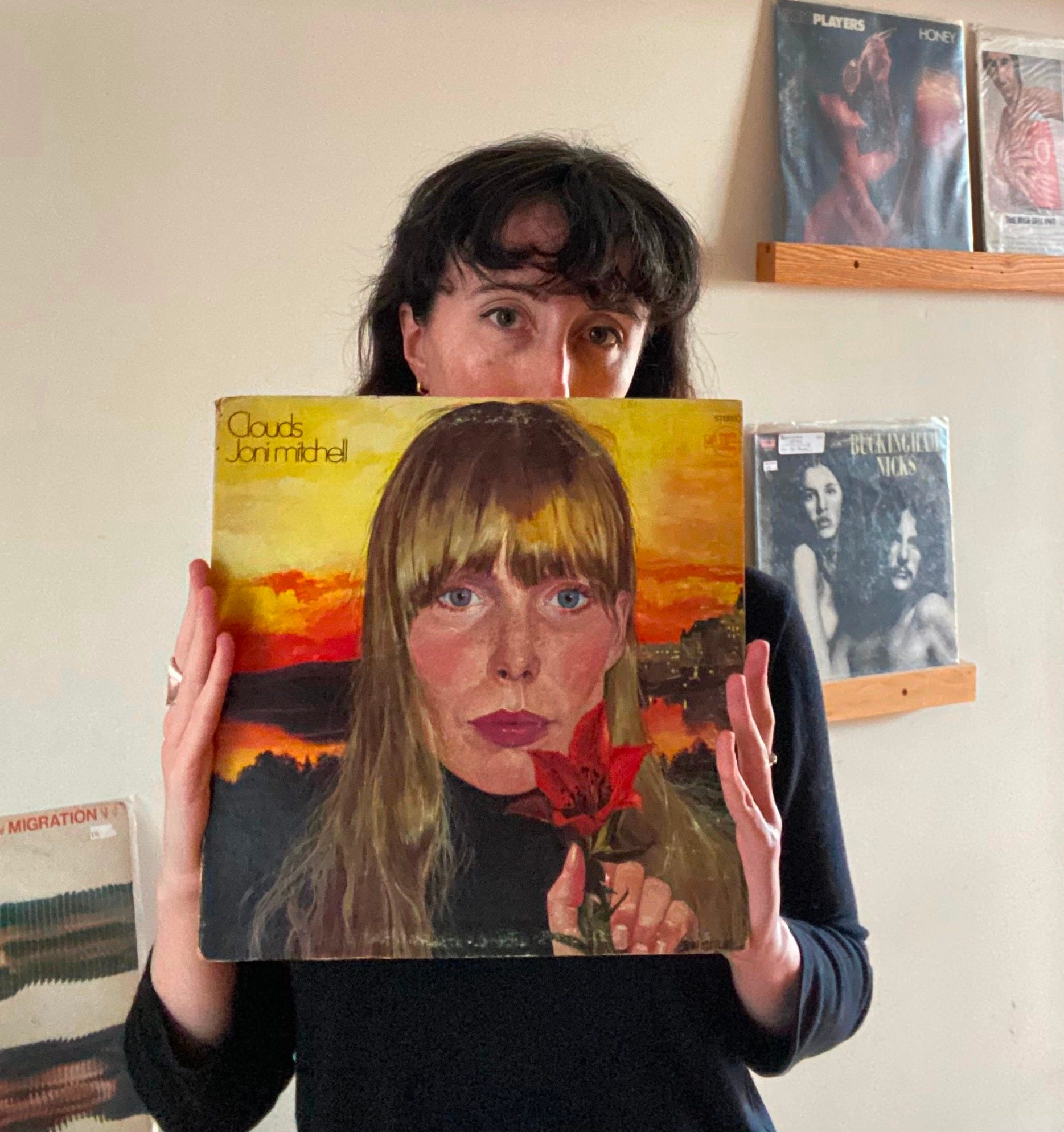
This is what I picture when Rachel Cabitt mentions her someday-dreams of the world’s first-ever “vinyl art library” — an attainable utopia only an album designer would envision.
As the co-founder and creative director of POND Creative, Rachel helps emerging artists put out the finest-looking record they can. To keep herself sharp and inspired, Rachel started writing a Substack during the pandemic. The Art of Cover Art is a “living reference” in which she spawns discussion surrounding the diverse, historical, persuasive, and undeniably underrated art form.
We met in our early 20s, when Rachel hired me to write a piece about an electronic duo playing a gig at Baby’s All Right in Williamsburg. It was the first time I’d ever interviewed a band in person. It was the first time I’d ever been to Brooklyn. (I think I made a fool of myself.)
Anyway, here’s our lovely conversation about the ins and outs of album art, complete with vibrant covers (some of which Rachel designed with her team), new tunes, and library plans — It’s quite visual!
So what was the first record that kicked off your love of album artwork?
The first cover I remember vividly loving is Avril Lavigne’s “Let Go” (laughs), but that was a CD.
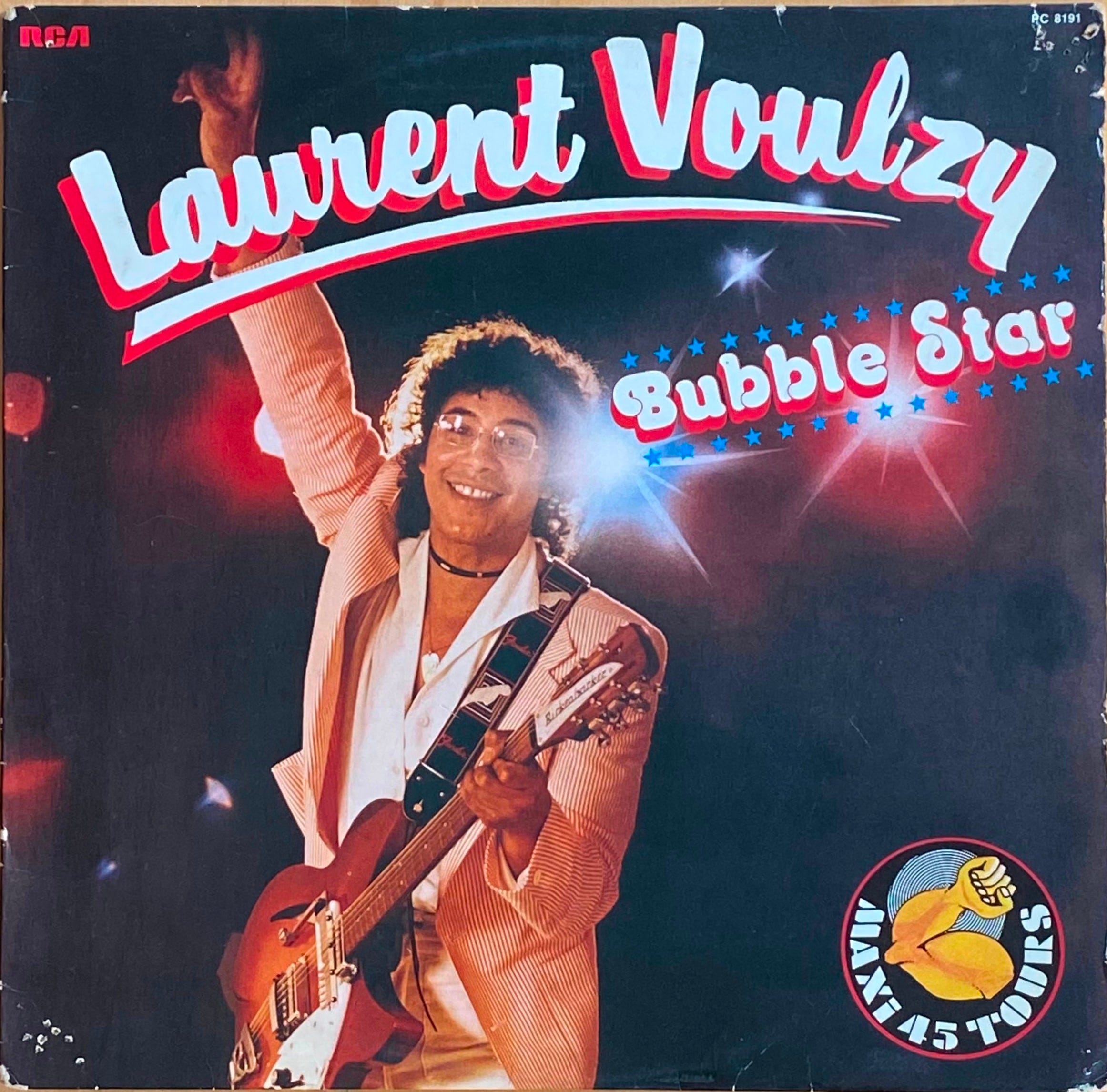
For vinyl, it was when my mom and I were at a flea market in a small town in France and I saw some French records for like 2 euros. I bought a bunch of them. I was 23, or 24 — I still have them in my apartment.
Can you describe them?
One of the records had a really cheeky image that made the cover look like a painter’s paint palette. And another was by a guy — Laurent Voulzy — who looks so 80s, with big hair and even bigger glasses.
Do you ever listen to them now?
No. The music itself is so…funny.
Since then, I’ve realized that when I’m in a record store, oftentimes I’m trying to find cool visual references for the future, so that when I’m designing vinyl for an artist, I can go through my records, and seek out some inspiration points for a project.
I honestly don’t think I’ve listened to half my vinyl…
When you’re perusing a record shop for cover art, what are you looking for?
I’ll search for examples of, say, typography, and then seek out covers with interesting type. One time I was writing a piece on album covers that were blue, so I went to a shop and looked solely for records utilizing the color blue in different ways.
Joni Mitchell.
Exactly.
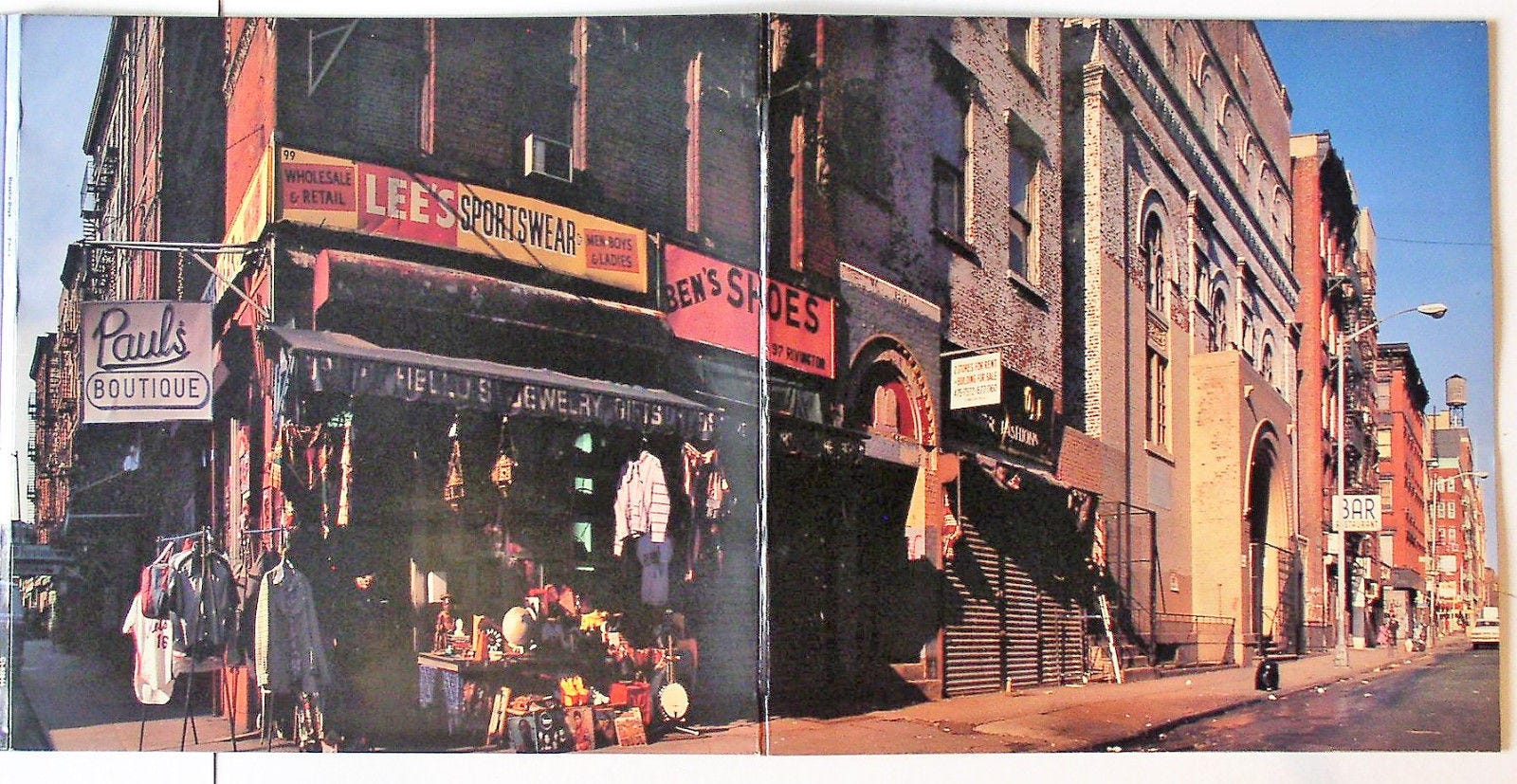
One time I was down the street at Scorpion Records, and I found the Beastie Boys’ “Paul’s Boutique” record with all the street scenes inside. They didn’t have the actual vinyl in there, but I wanted the album art! So I bought it anyway.

Is there a certain theme you’re currently investigating?
Do you know the Command record label? They have this percussion jazz series from the 60s — “Persuasive Percussion,” it’s all “P” alliteration names.
The album art is so fun, it’s 60s mod, with minimalist abstract shapes. It just looks like percussion visualized, it’s very beat-centric. I’ve been meaning to write about those covers and all the designers who collaborated on them.
 - Fonts In Use")
Woah, so the album artwork itself is indicative of the sound — do you think that’s an essential element for cover art design? Or just something you appreciate?
I don’t find it essential, but I do prefer it, personally. Sometimes POND works with artists who have a cool visual in mind, but I think to myself, “You don’t sound like that at all…”
Ultimately, it’s the artist’s decision, but they should have some cohesive thread between their cover and their sound — those worlds aren’t separate. When it comes back to the origin of album art, its sole purpose was to market records for people who had never heard the artist.
So maybe I’m a bit of a purist. But then again, there are people who totally reinvent the wheel and that’s sick too.
Can you think of a band whose album doesn’t sound like their cover art?
At South By (SXSW), there was this band Dutch Interior playing, and I only knew their album covers, which are super glitchy; I’d always thought they were a hyper-pop band, but they ended up sounding like a modern version of The Band.
I love their music, but felt thrown off at first by the aesthetic.
If I don’t know a band, the first thing I’ll take into consideration is their cover art, whether its in a record store or on Spotify or in a friend’s collection.
I wrote this piece on album covers that are a solid color, and for some artists it works. The color will have an intention behind it. But some designers seem to choose a random color when they run out of ideas.
Is there a recent cover you’ve designed that you feel tellingly encapsulates the music?
We did an album campaign for Dead Gowns, an artist on the Mtn Laurel label who makes beautiful folk rock. Some of her songs are sung in French. When we were talking with her, she wanted to go with a classic, timeless portrait.
So, we decided to reference legendary female French singers, like Jane Birkin and Francoise Hardy, just to have that cultural and historical link. Still when I see the cover we shot, the black and white portrait jumps out at me.
Timeless is timeless for a reason.


I love photographs as covers. Some Big Thief records come to mind. Seeing those blown up on an LP is so impactful.
In this digital era we’re in, these timeless covers can feel really fresh. They’ll stand out and make their mark, even on a small scale, like on Discogs or a Spotify playlist.
Do you have a pantheon of favorite record covers?
Oh gosh, off the top of my head, anything by Joni Mitchell. I love when an artist does their own album art, it’s like they’re building a whole story.
We were working with Horse Jumper of Love and Dimitri, the lead singer, is super inspired by outsider art, so all of the album covers are drawn by him. We just helped make his design feel more polished.

Is there an artist that you would absolutely love to work with?
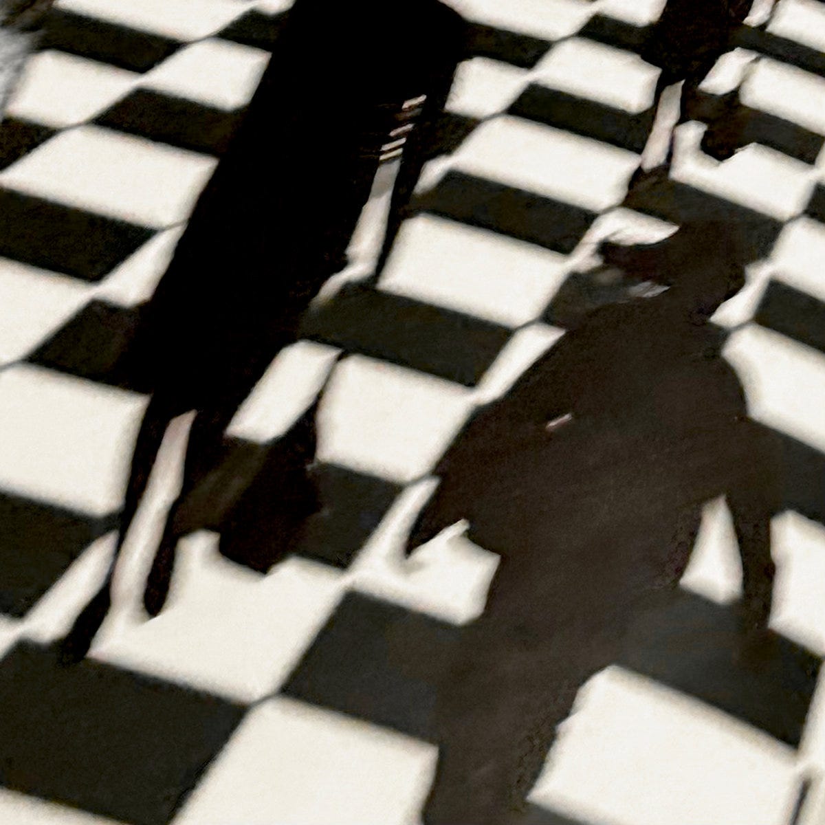
I really love Smerz. They’re based in Copenhagen and just released a new album with great cover art — an image of shadowy figures across a checkered floor, and I’m pretty sure they shot it on an iPhone.
I’d love to work with them, but they’re just so fucking cool, they don’t need me.
Do you think album artwork is a respected art form?
Not compared to other forms of visual art.
I have a ridiculous dream of building up a library dedicated to album artwork. Imagine a huge public space where people could seek out any record they wanted based on variations in cover art.
Like with your own vinyl dewey decimal system?
Totally.
Somehow, my friend once scored me a meeting with the CEO of Atlantic Records, Craig Kallman, and we chatted about his massive vinyl warehouse, which has over a million records in it, as well as designated listening areas.
But his records are barely organized.
So I want to reach back out to Craig and tell him I’ll organize his collection for free if he lets me use it to start the world’s first vinyl art library — it’s an ongoing dream of mine.

What a cool article! I think that this library idea should be more than a dream!!! She needs to make it happen!! Thank you for sharing!!